Creating compelling graphics is not only a handy skill to have, but it is also an integral part of your marketing plan and its success. People who consume poorly-designed, cluttered graphics are much more likely to turn away from your campaign, versus those who are engaged with clean, beautiful designs.
Here in Part One: Color, I will elaborate on the most important basics of color. Read on below!
Delight Your Audience With Great Color Palettes
The human eye can see up to 10 million colors. [Source: American Academy of Ophthalmology]. Sometimes, it can be hard to pick just one! In order to really catch attention and have your message stand out in a visual way, you should try to use between 1 and a maximum of 4 colors in your designs. This helps reduce clutter, and it helps your audience focus on and interpret the point of your message much more quickly.

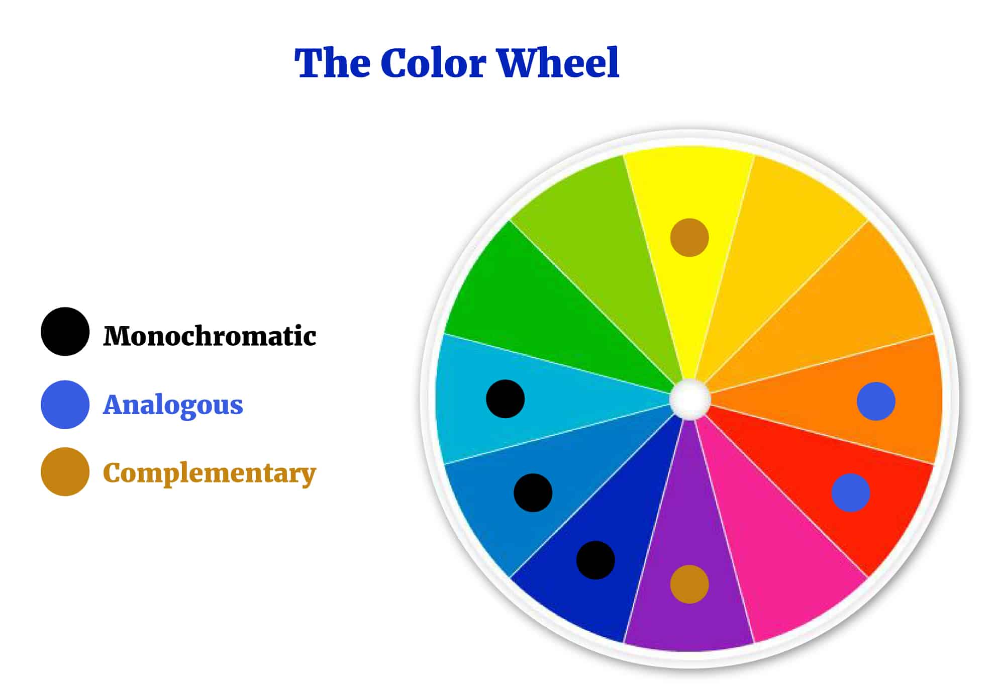
Color wheel: You have probably heard of this term before, but maybe didn’t explore it further. It’s a good idea to understand the color wheel because it helps you pinpoint the best contrasting and complementing colors to your color of choice. If you want to create a graphic with a green background, for example, using a color wheel can help you visualize which contrasting color (located on or around the opposite side of the wheel) will work best with that green. To get a free printable copy of a color wheel you can reference as you design graphics, click here.

Using Contrast to Create Compelling Designs
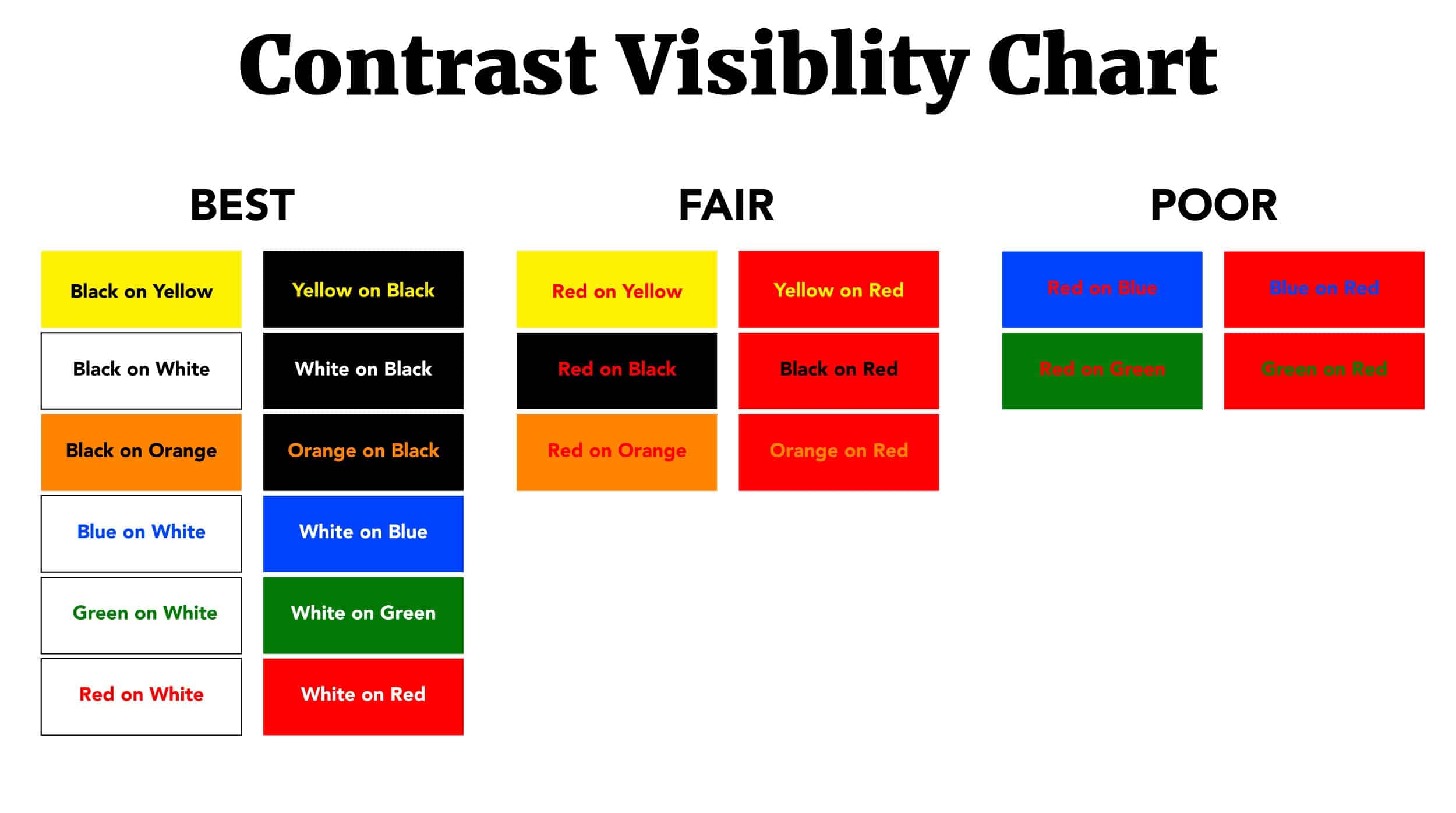
Contrast is a word we hear all the time; in design, it simply means the difference between two tones or colors. Take this example; black and white create very high contrast, whereas blue and green (more closely related) create low contrast. When you design your graphics, be certain the colors you use (for instance, text against a background color) are highly contrasting. Some examples of great contrast are below. [Source: Designhill]

Calls-to-action (CTAs) are a crucial part of your marketing campaigns. When designing these, be sure your colors match or relate to the action you wish your audience to take. For example, try not to use white text on a bright red background if your CTA is asking your audience to GO somewhere. Red is the universal color of stopping, which is not what we want our potential leads to do.
It is also noted by web designers that the color red on the web is difficult, even painful, to read and can tire your visitors’ eyes very quickly! To update an old logo that may incorporate bright red, try using a muted or darker version of the color to help ease the eye. [Source: SitePoint.com]


Color and emotion go hand-in-hand. Color theory is “a body of practical guidance to color mixing and the visual effects of a specific color combination.” [Source: Wikipedia] This is why your graphic designs must be effective, in order to catch and keep the attention and evoke an emotionally-driven response from your audience. Below are some examples of different colors and their meanings, so you can utilize color theory in your next design – or even your company’s branding plan! [Source: Color Wheel Pro]
Blue – Trust, intelligence, stability, confidence
Red – Power, strength, determination, passion
Purple – Royalty, luxury, nobility, ambition
Yellow – Joy, happiness, playfulness, energy
Green – Harmony, growth, freshness, nature
White – Innocence, purity, perfection, cleanliness
Black – Power, elegance, formality, mystery
Creating an Effective Color Scheme
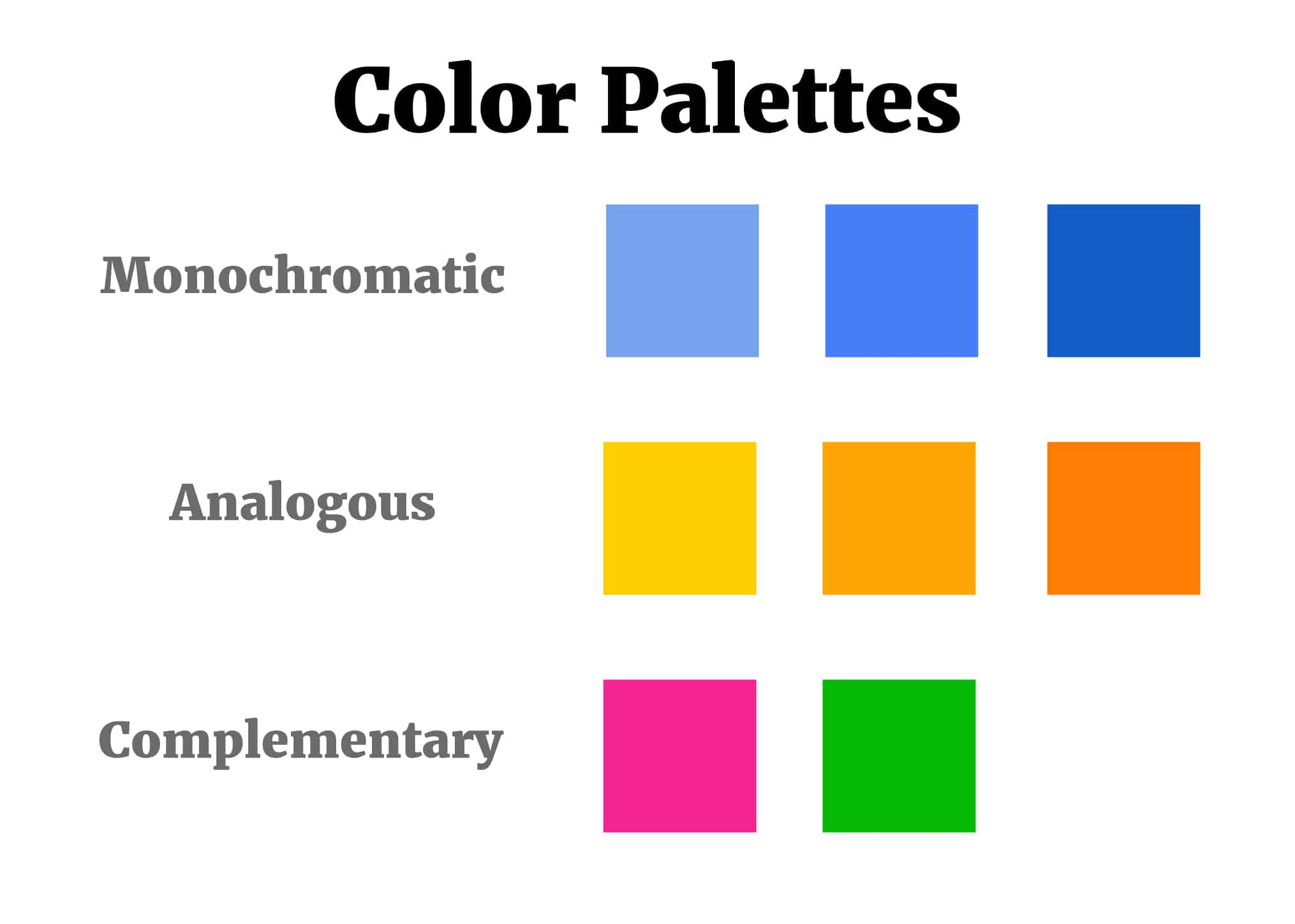
Color scheme simply refers to the group of colors you use in your design. Creating one can be less simple for some, however, and should take careful thought. There are several different types of color schemes, but we’ll dig into the most common three below. [Source: OC Creates]
Monochromatic: Uses one single color and close variants of that color. These schemes tend to be the most calming as the colors used in them are all very similar.
Analogous: Uses colors that are harmonious with one another, either from a warm spectrum or from a cool one.
Complementary: Uses two colors that are perfect complements of each other. A good example is red and blue.

You should now have a bit deeper understanding of using color in your graphic designs to create compelling, eye-catching graphics. Next time, in Part Two: Imagery and Typography, I’ll arm you with even more design knowledge!


