Learn how to create landing pages your users will love using these four tips. Each tip includes a real example landing page to illustrate each idea. Look carefully, and you’ll find plenty of ideas for your next inbound marketing campaign.
1) Establish 1 purpose and 1 action for the page
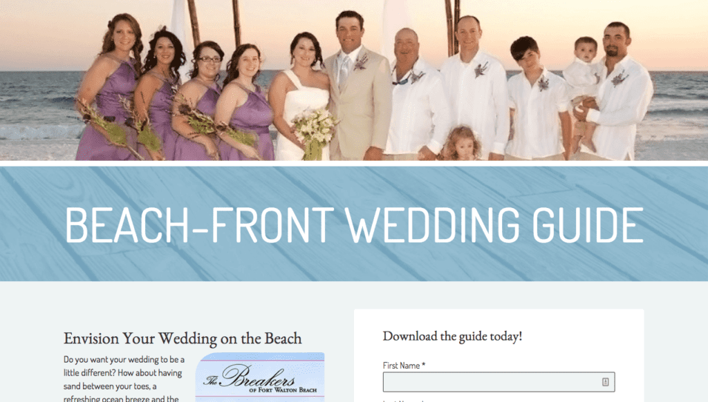
A good landing page has one very specific purpose. Including more than one purpose can confuse or distract users, and keep them from completing the action you want them to. For example, a vacation rental company wants to increase their on-site weddings. The landing page for this campaign should only include information on why their location is great for weddings; nothing else. The wedding landing page from The Breakers of Fort Walton Beach below has only one purpose – to persuade users to download their wedding guide.


2) Write a Great Headline
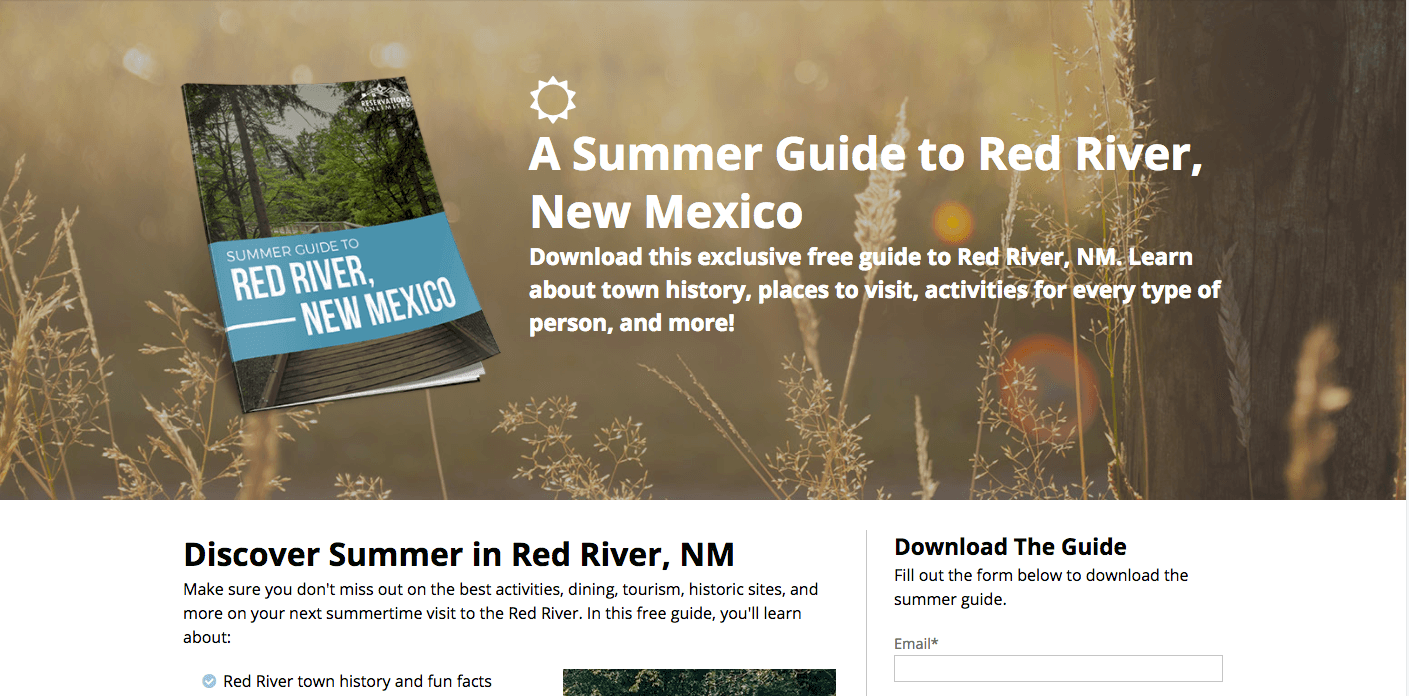
Sometimes, the headline will be the only part of the page your users read. The headline should communicate the purpose of the page, and motivate users to take action. See the landing page from Reservations Unlimited below. Their headline tells users exactly what they will get if they take action and sign up.

3) Short & Sweet
In general, landing pages don’t need to have huge paragraphs of content. It’s usually better to keep content short, making it easier to read and scan. Try to use:
- Bullet Point lists
- Short paragraphs (2-3 sentences)
- An image of the offer (eBook cover, preview, etc.)
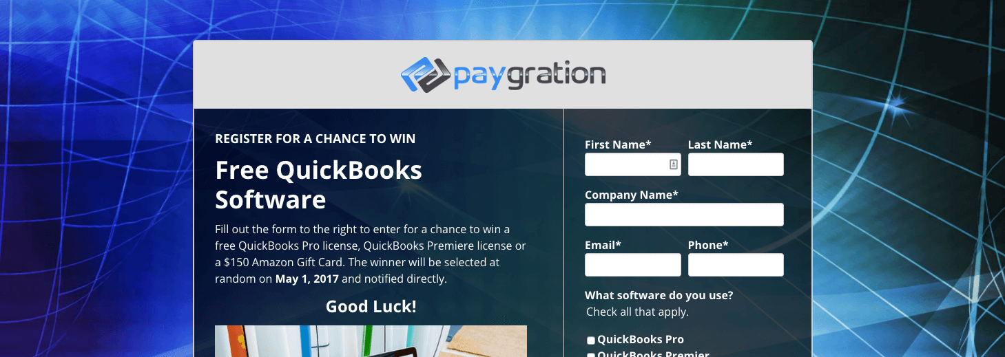
The landing page below gets straight to the point – with just enough information so the user knows what to do.

Of course, depending on your purpose, you may need to give your users more information before they take an action. You may need to include explanatory sections, testimonials, and more.
Include only what your user will need to make a decision and take action.
4) Make the purpose of the page obvious to the user
You want your users to take a specific action. Great. But how do you get them to do it? The simple answer is: make it very obvious. Make it so obvious, the user has no doubt what to do once they see your page. Here are a few tips to do this:
- Include the action (button, form, etc) near the top of the page, so users see it right away
- Give contrast to the action item, using a different color, shape, size, etc.
- Add white space around the action item to separate it from the rest of the content
- Remove navigation from the page if possible
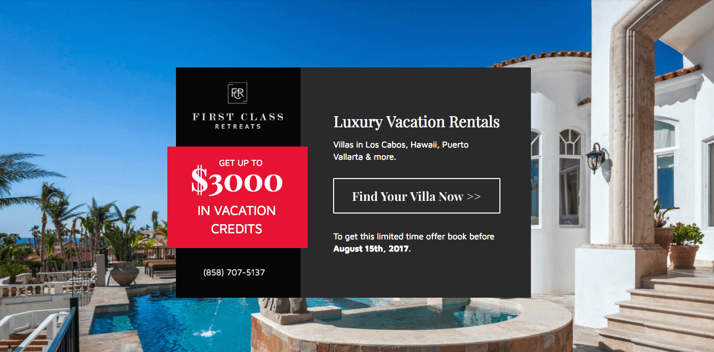
In the example below, user know right away what this page is offering ($3000 in vacation credits). The button is also prominently placed, standing out from the page, and telling users exactly what will happen when they click.

Don’t Forget!
Once you have a great landing page, make sure your users can get to it. Link to the landing page from relevant pages of your site using an eye-catching call to action. Then, after a user completes the action on the landing page, make sure the page they see next (thank you page, download page, etc.) looks stunning too.
Do you have a favorite landing page? Post it below in the comments.


