The Internet is Full of Clones
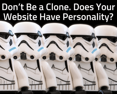
While I was apartment hunting a couple of months ago, I started to notice that about half of the apartment complex websites I visited used the exact same website template and layout. Each site swapped out a few images and colors, but on the whole, each website was a clone of the next. How was I supposed to choose between these complexes when they all seemed the same to me?
All industries, including apartment rentals, are suffering from this same problem. Because of the widespread use of plug-and-play website templates, many companies simply choose a template, swap out some content, and publish. Although it’s fast and easy, creating your website like this will:
- Make you blend in with everyone else in your industry
- Make your brand indistinguishable
- Decrease the success of your website
What Makes You Memorable?
Instead of creating another clone, make your website stand out to visitors. A website bursting with personality will welcome visitors to read more and explore your website. So how do you begin? First let’s answer two questions:
1) What makes your brand different from others in your industry?
First, you need to define what makes your company different. If this isn’t clear to you, it definitely won’t be clear to your customers when they view your website. Once you define what separates your brand from the crowd, emphasize this on your website using headlines and related images.
2) What makes your brand memorable?
Next, think about what makes visitors and customers remember who you are and what you do. Is it your stellar customer service? Or your great benefits? Your funny demeanor? Whatever it is, this feature should be readily apparent in the design and content of your website.
Warning! Don’t Go Overboard.
Adding brand personality to your website is super fun, but be careful not to get too carried away. Your website doesn’t need huge images, a unique background texture, an artistic headline font, AND parallax scrolling. Instead, use one or two of these to add a good deal of personality to your website. Watch Out: using more than a couple of these features makes your website look more like a technical experiment rather than an engaging experience.
A little goes a long ways. Try out just one of these subtle elements to your website and see how it impacts your website’s personality:
- Add a stylized horizontal rule to separate content sections
- Add a border or other subtle style to your images
- Consider a fancy drop capital to begin blog entries
- Stylize your H1 titles on each page by adding an underline or icon
Want To Get Started?
To help you get on your way to creating an amazing brand personality, we’ve created a free interactive (or printable) PDF Brand Personality Template for you to download and fill out.


